Recently my sister asked me to plot a bar chart in excel from a table of data. There were 5 different columns but she only wants to choose 2 columns, one going to X- Axis/Axes or Y-Axis/Axes.
Now initially when I heard about this, I thought ohh, its just a piece of cake.. right because excel is known for its charts and it should be easy. But soon I realized its not..here is why..
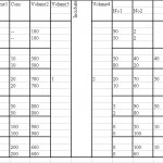
Before we start that I should show how my table looks like :
Now I have to extract data from Conc column to show as X-Axis and % (percentage) as Y-Axis
By default when you export data from table into charts by going to Insert > Chart and you choose the chart, be it the column or bar chart, it only gives either X axis or Y axis to give the data range. And Excel automatically selects the other axis.
Now this is not what I want, I need to plot both axis. After couple of googling, i found that this cannot be done straight away. I may be wrong but this is how it worked for me…
Go to Insert > Chart and Select from Standard Types select XY (Scatter) go to next button, here it should show Chart Wizard – Step 2 of 4 – Chart Source Data. Here select the 2nd tab that says Series.
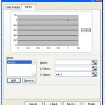
Here under series , you will series heading with a small box with Add button, click the Add button which will pop up with these :
Under name you can either type in the name or clicking on the small icon besides will let you select the data range from the excel sheets. You can select X-Axis values by clicking on the icon to select the data range starting from the values (excluding the heading/title) Do the same for Y-Axis values.This can be done by clicking from the top cell down to bottom till the end of the data cell.
Click on next, you should be in Chart Wizard – Step 3 of 4 – Chart Source Data You can give the title for X & Y Axis . Go to legend tab in the same step and I choose to show the legend at the bottom, it sort of gives my graph a better room to show data. You can remove this legend later. Go to next step and click on finish.
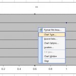
Now you should have a Scattered Graph, which is not what we want, therefore, Right Click on the Graph area, which will drop down a menu with some options, select change chart type
Clicking on chart type will give you the Chart Type window and Select the Bar or Column Chart from this window.
Now you should be able to see bar or column layout of your graph with X & Y Axis plotted. That’s it off you go!!


This is often a fantastic web site which aids me to have a lot more information to the topic. I’m going to bookmark it!
hey i read your web log every the time, you have numerous wonderful things to say. My reviewers would like your flair, do you consider you could be a guest blogger for me?
Thanks helped a lot 🙂
Great help!
Hey thanks. Well done
Asking questions are genuinely nice thing if you are not understanding something entirely, however this paragraph gives good understanding even.
I really like what you guys are usually up too. This sort of clever work and coverage!
Keep up the excellent works guys I’ve incorporated you guys to my personal blogroll.
Niсе post. I beсаme checking constantly this weblog аnd I’m impressed! Very helpful info specifically the last part 🙂 I take care of such information a good deal. I became seeking this certain info for one very lengthy time. Thanks and good luck.
If a residential plot of 47ftx18ft is divided into 16 equal parts by drawing lines from the centre of plot making 16 triangles of 11.25 degrees,how can I measure the triangles area of all 16 triangles saparately and show the values of all on a bar chart. Thnx..Jasvir
You’ve got described a very good details , regards in your post.
This does not work on Mac Excel 2010.
x-y scatter -> column creates a graph with x-axis being filled equally-spaced data points (instead of 1.3…..9, on gets 139) while y-axis data is plotted correctly.
Thanks, that works also in MSOffice 2010 Professional for Win8!
Thanks again!
I read a lot of interesting content here. Probably you spend a
lot of time writing, i know how to save you a lot of time, there
is an online tool that creates readable, google friendly
posts in seconds, just search in google – laranitas free
content source